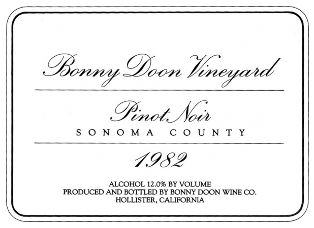
 It is a pleasure to be here today to talk about wine packaging and labeling, a subject I never imagined I’d be qualified to talk about, but something about which, like it or not, as an entrepreneurial winery owner, I’ve been compelled to try to master. I started out in the wine business with the relatively ambitious intention of making The Great American Pinot Noir, which is to say, a wine more or less thoroughly Burgundian in style, as I understood that to be. I felt it important to signal my intense and sincere francophilia in this earliest effort, so I more or less copied the style of the Louis Latour and Hubert de Montille labels. This was for me my very Introductory Course, Wine Labeling 101, if you will.
The label is so simple and elegant. In fact, in the beginning I just wanted to make simple, elegant wines asnd wine labels, and of course, naively believed I could just let the wine itself do the relevant salesmanship. (Boy, did I have a lot to learn!)
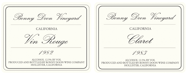
Here are some of the very earliest labels that we did. “Vin Rouge,” which was a blend of Grenache and Cabernet Sauvignon and “Claret,” which was a bordelais blend – pretty austere design, no? Same basic concept as the Pinot Noir, but without the benefit of varietal designation. Thank goodness in those days selling wine was a lot easier to do than it is now. These bottlings, as you might imagine, did not exactly set the wine world on fire. I believe it is fair to say that unless one is faced with something like an existential threat, one generally does not have the disposition to venture too far out of one’s comfort zone, and probably if the Pinot had been a runaway success (it wasn’t) I may never have had the occasion to think up vivid, memorable and oh-so clever labels. But as they say about the prospect of one’s imminent demise having the tendency to focus the mind, there are certainly comparable dynamics at work in the world of very challenging wine selling and wine packaging.
 So, while my original intention in getting into the wine business was to produce The Great American Pinot Noir, I discovered soon that my Pinot project wasn’t working so well and I knew that I needed to pivot in a very significant way and find a different focus for the winery if I wanted to stay in business.
At this time I was beginning to spend some time with a fairly obscure Albanian wine merchant, called Kermit Lynch, who had a little store in Albany, CA. Kermit was and is a great fan of the wines of southern France, and I had a simple idea that maybe the varieties of southern France would be well suited to the Central Coast of California, a hypothesis that has in fact luckily been borne out. So, in the interest of staking out some well-differentiated territory with essentially no competitors, Blue Ocean, as they say, I set out to produce a sort of homage to Châteauneuf-du-Pape. But what to call it? My first thought was that I needed to somehow clue customers in to the fact that was a wine made in the style of a Chateauneuf. But how could I do it in a way that wasn’t totally lame and forced?
My own pretentions notwithstanding, I had always thought that domestic wine labels pretending to be quasi-French were more than a little pretentious, if not just doonright silly. Still, I wanted to give customers a context for understanding the wine – remember that no one then knew anything at all about Rhône varieties – as well as to signal that my wine was très French in inspiration, if not in style. Of course, at the same time I didn’t want to be seen as an out and out copycat. What I needed to do was make a sly and witty reference to Châteauneuf and to show the world how cool and witty and non-copycat a New World copycat could be.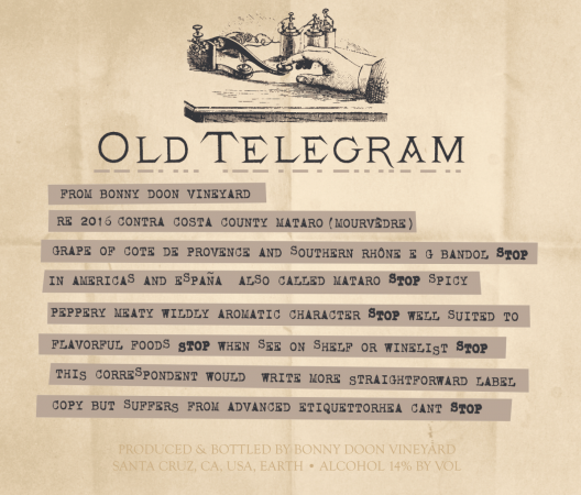
I came up with the name, “Old Telegram” which was of course a reference to one of Kermit’s Châteauneufs, “Vieux Télégraphe. In all of my years in the wine business, people always ask me, “How do I come up with all of these label ideas?”

I usually just tell them, “Drugs,” and they laugh and wink, but honestly, I don’t really know where the ideas come from, but often they just come from some strange place; maybe the same place that gives forth verbal puns also produces visual puns. But remember, it can be a two-edged sword; he who lives by the yucks, can also die by yucks, as I was subsequently to learn at great cost.
In any event, once the wine was named “Old Telegram” I knew in a flash that the label just had to look a real old telegram, with the ticker-tape pasted on the paper and the use of the word “STOP” breaking up sentences. (That’s an old vaudeville schtick, by the way.) We even managed to get some Morse code dots and dashes embossed on the label. (It’s my conceit that someone somewhere out there appreciates this extra level of fanatical detail; maybe just maybe that is why some of our labels have made such an impression over the years.) So, Plan A was to call the wine “Old Telegram” but just as the Grenache grapes were about to arrive at the door, I thought it wouldn’t hurt to do a bit more research on the whole subject of Chateauneuf-du-Pape.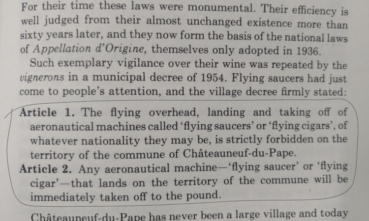
I found a copy of the Livingstone-Learmonth book, “The Wines of the Rhône” and came across an interesting passage about how in 1954 the mayor of one of the towns of Chateauneuf-du-Pape was quite concerned about flying saucers and flying cigares landing in the vineyards, and he persuaded the town council to adopt legislation prohibiting such landings. The moment I read this I immediately thought that this would make a better label for a faux-Chateauneuf, because it was funnier and a more all-encompassing joke, i.e. you didn’t need special knowledge to appreciate it. (We did, of course later recycle the Old Telegram concept for our 100% Mourvèdre.)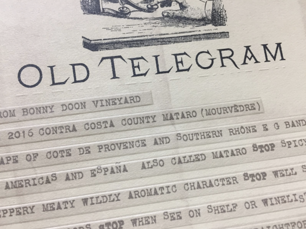
Again, the idea was to reference the context (in this case, Chateauneuf), take a classic look but do something slightly subversive with it, with the idea of letting the knowledgeable wine-drinking insider in on a private joke. It’s hard for people to always remember names of things but the fact that there was a UFO on the label would certainly make the package memorable. But, the real salient point here is that I was trying to introduce a new, unknown style of wine to the American public and needed to overcome the customer’s inherent reticence about asking about something they didn’t know. When you ask, “Why is the wine called “Le Cigare Volant” this allows a server in the restaurant to overcome his or her own shyness so they can feel free to to tell a story about this crazy law in southern France. You’re thus using humor as a means to lowering the barrier to entry to the sometimes formidable, mysterious world of wine. The “Cigare Volant” meme has actually been quite powerful, even infiltrating popular culture, showing up as the name of a snooty French restaurant for which the character Frasier Crane could never obtain a reservation.

We’ve riffed endlessly on the whole “Cigare” theme and for a while even packed the bottles in a sort of over-sized Cigare box, replete with faux-governmental warnings (“Will lead to disinhibitory behavior”) and a citation that it was bottled in La Republica Doonimicana.
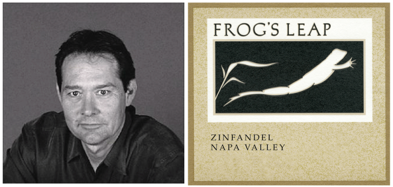

I would be remiss in not mentioning that I have been very privileged to work with Chuck House, the brilliant label designer responsible for the Cigare label and so many others. I began working with him in 1985; he had just designed but one label at that time, the utterly genius “Frog’s Leap” label, which was winning all sorts of design awards. It was a relatively subversive idea at the time to use humor on a wine label; eccentric Walter Taylor in New York was the only one to have tried it and he was generally regarded as a kook. Using humor while trying to represent a wine of some substance creates a very fine line that one must walk, as I’ve learned.
The one thing that Chuck taught me is that a wine label is your opportunity to tell your customer what they can likely expect from what’s inside the bottle, set their expectations as far as style, quality, price, etc. You don’t want to create a situation of cognitive dissonance where the package promises something that the wine can’t deliver. Maybe I’m overstating it a bit but your wine label is something like a real opportunity to potentially bond with your customer, to create a sort of mini-affinity group. The customer identifies with the person who he or she imagines appreciates this sort of wine.
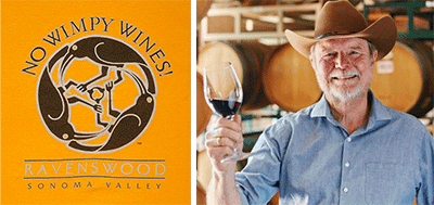
This isn’t a wine label, but a bumper-sticker for Ravenswood wines. Joel Peterson is an absolutely brilliant marketer. He somehow was able to capture the quintessence of a Ravenswood Zinfandel wine drinker – someone who will simply not abide wimpy wines. The customer himself is not a wimp, nor, by extension, are the wines that he (it’s usually a he in this case) prefers.
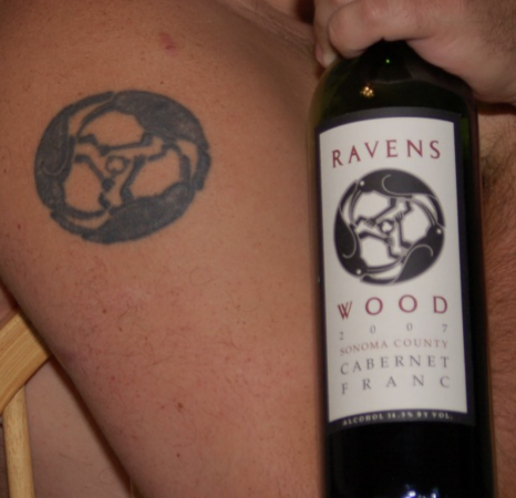
The brand loyalty generated by the sort of identification of the customer with a brand is absolutely impressive. Joel told me that so many people had the Ravenswood logo actually tattooed on themselves – the design is, truth be told, a form of a very powerfully iconic and hypnotic swastika – that he took the initiative to produce Ravenswood logo applied tattoos. The one thing I do know is that customers sometimes project their fantasies about who you are based on the clues you provide them.
I don’t know which particular label or labels earned me the reputation as a contrarian “rebel” or anti-authoritarian but for whatever reason, for quite some time, at the con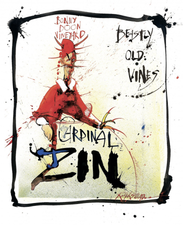 clusion of winemaker dinners I would often be approached by fans of our wine who would either proffer me the secret Libertarian handshake, imagining that I had to be one of them, or alternately, lay a joint on me, imagining that I likewise shared a common interest in weed. “So, I understand that you’re crazy,” I would sometimes be told. Here is the utterly iconic “Cardinal Zin” label designed by Ralph Steadman, which is quite brilliant, and there’s no question at all that it was the label that really made this wine successful. The essence of the label is course the visual pun on the dual meanings of the word “Cardinal,” but I believe that somehow Ralph accidentally (or not) hit on a resonant chord with Zinfandel drinkers, at least the ones that I’ve had occasion to meet attending ZAP tastings for many years. Definitely a more disinhibited wine consumer than say your buttoned-down Bordeaux drinker. Definitely like to party, if you will; this label spoke to them. Obviously, Ralph is a genius illustrator, but working with him has had its challenges. Ralph does not take direction well. If you tell him, “Ralph, please do X; the only certain result will be that he will do Not-X.” So, I would just tell him the dimensions of the label and perhaps the name of the wine.

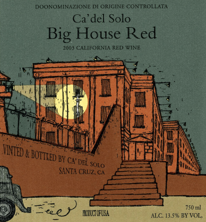
We produced a number of wine labels that were thought of as being slightly subversive or at least highly irreverent – one of course was Big House, so named because of the proximity of our vineyard to the storied Soledad prison. (For the record, Chuck House modeled the illustration after the Alcatraz prison, which was architecturally a lot more interesting.) Big House was far and away our most significant wine brand, and while it was a great commercial success, there is no question in my mind that it may have slightly tainted the perception of the overall gravitas of the brand.
There is an old joke about what they call you after having carnal relations with just one goat; even now more than 10 years after the sale of the brand, I’m afraid that Big House may have been my “one goat.”
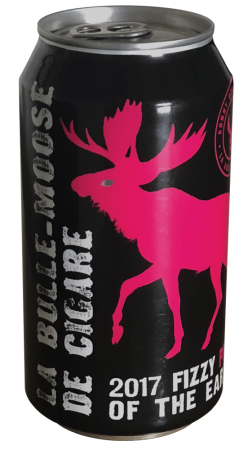
On the subject of critters, we’ve had just a few on our labels in the past – a dog and a cat on the Ca’ del Solo labels, but in general, I’ve tried to make a pretty conscious effort to avoid critter labels whenever possible – they have become rather clichéed, to say the least. It is therefore a bit ironic that one of our most recent packages, La Bulle-Moose de Cigare, features, well, a moose, which seems to be, in fact, a critter. But, the reality is that when we lined it up side by side with a bunch of other potential label designs, the darn pink moose really stood out on the shelf. This would seem to not necessarily be a terrible thing, but we shall see.
Frankly, if I had my druthers, the naughty part of me would very much have enjoyed producing a label called “Road Kill Red,” possibly featuring a bunch of flattened kangaroos, bears, penguins, etc. My better angels prevailed and we never produced such a label, but part of me suspects that it would have 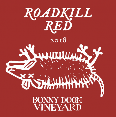 been a great hit, as it were. Which brings another point to mind: I had hoped at some point in this speech to be able to deliver some sort of overarching, feel-good message about the key to a successful wine package being something like, “If you just follow your intuition, act with integrity, and connect to the part of yourself that just knows – kind of like “May the label designing Force be with you!” – then you will certainly be successful. I wish I could promise you that. I used to imagine that I understood what were the relevant elements for a successful wine – impeccable value, brilliant package, compelling story, being part of a dynamic market category. At a minimum, you likely need all of these things, but cleverness in the extreme isn’t always enough. If there’s any consolation, to paraphrase the great songwriter and performer, Randy Newman, “Who needs money/ When you’re funny?”
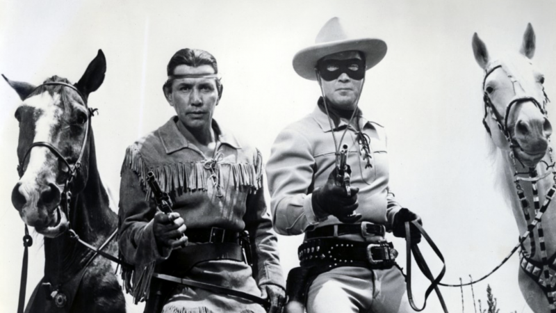
Now I think of myself not as the Rhône Ranger anymore, but rather as Tonto, I, Who Truly Know Nothing about the Wine Business. The number of factors that bear on the success of a particular brand is now nothing short of staggering. I am sorry to say that sometimes the greatest label design in the world won’t help at all if the market, in its infinite perversity, just doesn’t want your magnificent wine.
So, Chuck House drummed into me the desirability of showing on the outside of the bottle what a customer would find on the inside, and I think, perhaps in retrospect, I took his words perhaps a bit too literally. We went through a fairly long period of producing what you would call see-through labels, where part of the story was told on the front label and part of the story was told on the inside part of the back label. We were at the time launching a wine called “Pacific Rim Riesling” and I wanted to convey the fact that it was indeed a grape of German origin, and of course would complement Asian food. So, literalist that I was, the first design brief I gave Chuck was to illustrate an attractive Asian woman on the front label, who, when we observe her, has been reading a very heavy German philosophical tome, Kant, perhaps, and growing drowsy, has just fallen asleep. One then beheld as if through the looking glass, her dream on the inside part of the back label.
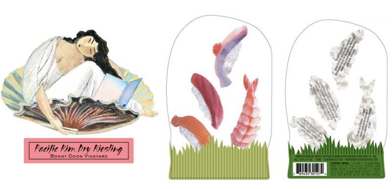
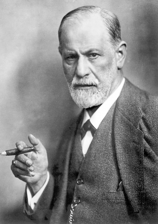
For the dream tableau, I had asked Chuck to draw a quaint Alsatian or German village, and in the illustration include a bunch of naughty Freudian dream symbols – mysterious flying cigars and a train coming out of a tunnel, that sort of thing. Chuck and I were set to meet at a Mexican restaurant in Rohnert Park that day to finalize the details of the label. But as fate would have it, the Mexican restaurant was temporarily closed owing to some health inspection issues, and we ended up eating at a Japanese sushi restaurant instead. The sushi menu had pictures of the various rolls and sashimi; and somehow I was inspired borrow Chuck’s X-acto knife so I could cut them up to play with. What we found was that if you pasted the sushi fish on the back of the bottle and you looked through the bottle and turned your head a certain way, it would look as if the fish were swimming around, and this seemed awfully cool. Anyhow, while I greatly loved the illustration of the quaint and naughty dream vil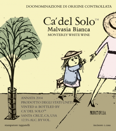 lage, I thought that the sushi would ultimately make for a more memorable label and perhaps speak to how the wine could be used at table. Alas, we never were particularly successful in selling the wine in to sushi restaurants.
When I mentioned that I intuitively moved in the direction of using humor to contextualize my homage to Chateauneuf, I imagined that I would have to use the same strategy of deploying disarming humor to even begin to sell my first case of wine made from (gasp) Italian grape varieties. Chuck House and I came up with the idea of using a kind of cartoonish illustration on a series of wines we made under the Ca’ del Solo label. This is a picture of little Malvasia Bianca on her first day of school, letting go of her mother’s hand, going “solo” (get it?) and of course, stepping on every crack in the sidewalk she comes across. You can see that Chuck and I are not shy about the inspiration we get from other illustrators.

We actually briefly got into a bit of trouble with Washington State, which objected to the “depiction of a minor child on a wine label.” I honestly was quite tempted to go with modifying the label to look something like this if Washington state had not backed down.
Chuck did a whole series of wine labels for us for our Ca’ del Solo series, which I think captured the sense of fun and adventure that I was trying to not so subliminally suggest to our potential customers.
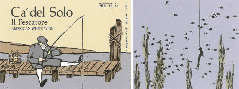
I rather liked the label we did for a wine called “Il Pescatore,” which was a white blend. Again, you had to look through the bottle to see what the fisherman had caught, which turned out to be a boot in the shape of Italy, a cunning metaphor for the fact that I was myself utterly caught up by the enchanting wines of la bella Italia. Chuck always would stress to me how careful you wanted to be in setting customer’s expectations with the label, and of course the cartoony labels carried with them a bit of baggage, i.e. an upward price limit. But, it is interesting how you can try to play with the form and tweak it, in this case towards representing a more serious and hence expensive wine.
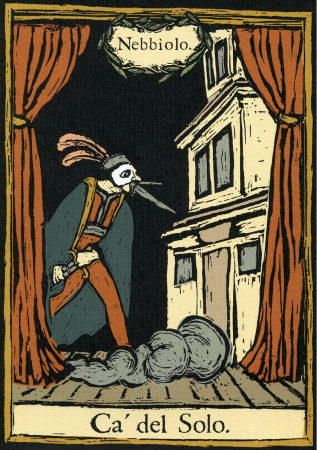
Against all odds, we produced a very good Nebbiolo from our Estate vineyard in Soledad. Good luck with selling domestic Nebbiolo, but we did with this sort of illustration inspired by the commedia del arte, manage to achieve a bit of a fine art quality to the label, which might have theoretically helped us in being able to command a higher price point, were this not such a challenging category. The brilliant label was not able to overcome the structural difficulty in selling domestic Nebbiolo.
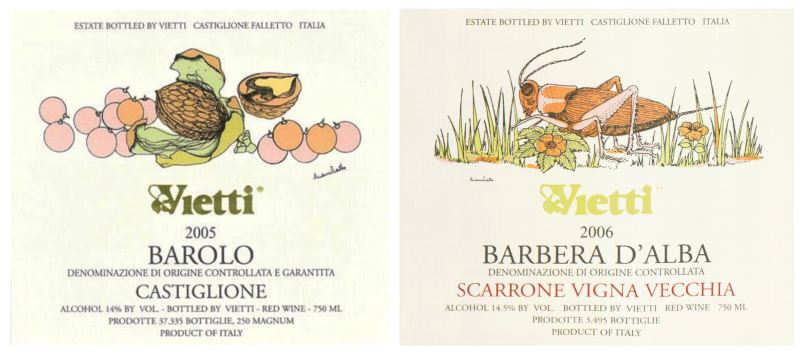
You can see that Italians themselves are not immune to playfulness on their labels with the very best of them, such as you see in the Vietti series done by Gianni Gallo, being truly fine art illustrations. I cannot stress how important the quality of the illustration is, however playful the subject, if you are serious about conveying a degree of gravitas about the wines.
While Bonny Doon was once among the very few to produce wine labels in a sort of jocular style, this style has seemingly exponentially proliferated, each trying to outdo the last in terms of the vividness of its visual appeal. I probably should have said this at the beginning of this presentation, but I do sometimes feel that I owe the wine world a formal apology for whatever part I played in helping to unleash this onslaught of total goofiness and questionable taste. Forgive me for I have Cardinal Zinned. Anyhow, to return to this phenomenon: Perhaps with these sorts of labels, wineries are trying to connect with the easily distracted millennial generation, but it seems like a race to see who can capture the putatively nano-second attention span of the millennial drinker. Obviously, there are many messages that are potentially communicated through the label, beginning with the obvious ones.
Don’t worry, customer, this wine will not be astringent or “hard,” in fact it will be sweet and very fruity. There will be no questions on the test about, God forbid, terroir. Go ahead, indulge yourself; it won’t bite.
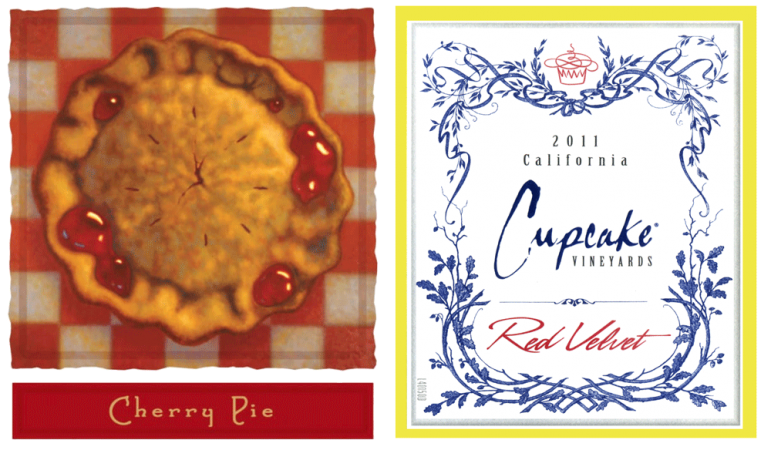
You’re not a wine snob. You’re a rebel, Dottie. You don’t mind shocking your friends a bit.
How did that get in here? What can I say? I’m a rebel, Dottie.

I have to share with you what was either the very best or very worst Bonny Doon package in history, which we did for our Wine Club. We called this little number, “Macho Nacho” because the wine itself, to my great chagrin, frankly tasted a bit like jalapeño taco chips. Applying these labels to the bottle required several advanced degrees in topology, but say what you will, the package was quite memorable. And, amazingly after 10 years or so in the bottle, the wine actually came around and tasted quite good.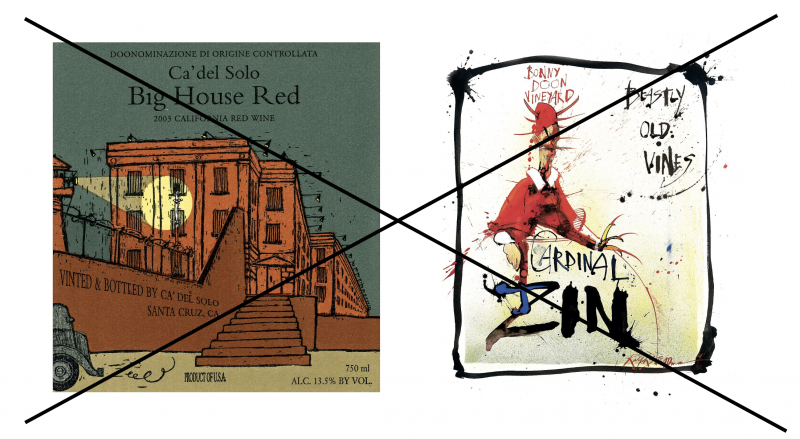
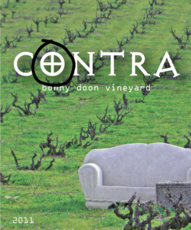
To be totally transparent, I’ve not been entirely successful with all of our packaging efforts. After I sold the Big House and Cardinal Zin brands, I was casting around to try to find a wine that I could produce in reasonable volume that could help us in the all important world of le cash-flow. I wanted to make a wine that would stylistically remain in the realm of southern France, if possible, and of course, reaffirm my abiding interest in the contribution of terroir or sense of place to the wine itself. I had had a lot of experience working with the old-vine Carignane, Zinfandel and Mourvèdre vineyards of Contra Costa County for several wines, and so, it seemed that I could potentially re-purpose them for a higher concept (i.e. old vine) blended wine, which we would call “Contra.” What could possibly go wrong?
I wanted to somehow capture the the sense of place of Oakley and Antioch, CA, and if you know the area at all, somehow this photograph of an abandoned couch in the vineyard very cogently expresses the je ne sais quoi of these (ahem) charming Delta towns. The wine itself was wonderful, got great reviews, but many of the wholesalers just hated the label and adamantly refused to carry the wine. You’ll note that there’s an interesting typographic detail; the type font selected for the word “Contra” is the so-called “Exocet” font, as I was trying to riff on the “Contra” insurgency group, with a small nod to the political persuasion of the Oakley populace. It was explained to me that NRA enthusiasm for the label notwithstanding, there were in fact some tender-hearted customers who were not crazy about this particular detail. I still sentimentally love this label, but perh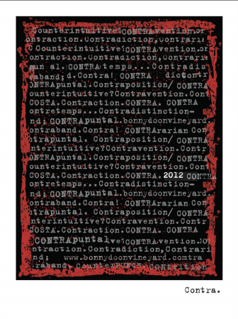 aps irony is dead.
Not being one to easily quit, we re-did the label and this is a magnificent effort by the brilliant Steven Solomon, who does the graphics for Terroir Wine Bar in NYC. It’s witty and edgy (like Steven), maybe a bit too reminiscent of some of the Charles Smith labels, but I really liked it. Radically changing package designs on a brand that is still teetering is not a particularly great recipe for success, so with a great sense of disappointment, we stopped making this truly worthy wine.
I think that I’ve been incredibly fortunate to have been able to use the medium of label design as a creative outlet, as well as even a form of public confessional. This is a label that we did for a wine called “Roussa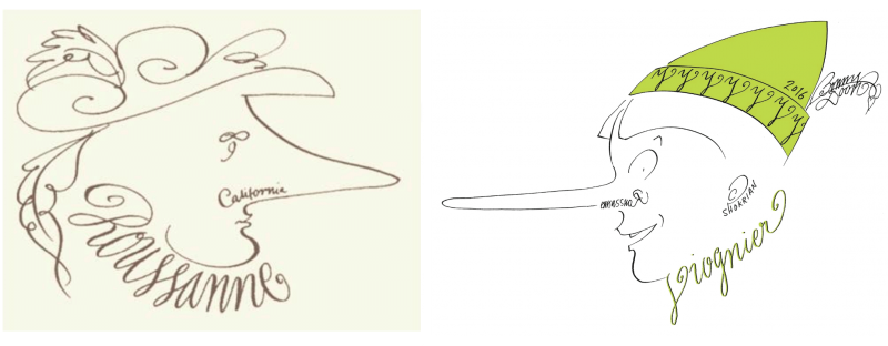 nne,” designed by a calligrapher, Wendy Cook, who had never before designed a wine label, but it is just amazing. (That’s Cyrano de Bergerac: Roussanne, Roxanne? Get it?) When it turned out that the “Roussanne” grapes we were using were not in fact Roussanne but Viognier, I just asked Wendy to do another label for us, and, voilà, Cyrano became Pinocchio. (If you look carefully, the word “Roussanne” written in backward script is visible in Pinocchio’s nostril.)
This reminds me of one of the most interesting packages we put together in the late ‘80s, when my own sense of taste was still careening wildly between the marginally sophisticated and the doonright outré. This was for the first Estate grown “Roussanne”/Marsanne blend, which we called “Le Sophiste.” Kind of a silly name; the Sophists were a school of Greek philosophers rather known for their proclivity for disputation and argument – giving us the terms “sophistry” (or argument by trickery) and “sophistication” (with its own ambiguous meaning). Chuck House loved to make torn paper collages from ephemera – newspapers, train ticket stubs, that sort of thing. The character on the label was meant to be invested with a degree of insouciance, a flâneur, if you will, though frankly, he did come off as looking a bit like Mr. Peanut. In lieu of a capsule, we had a special top-hat created for the package. (The cork itself was imprinted with the words, “Mise en bouteille au chapeau.” Sorry, I just couldn’t help myself.) I was thrilled when Larry Stone ordered five cases of Le Sophiste for Charlie Trotter’s restaurant, though he insisted that they be shipped without the top-hats, as he thought that they were too corny for his lah-di-dah clientele.
Occasionally, we would make a wine that was a commercial success, well despite the fact that the label was just not right. On the left you can see the original label design for Muscat, “Vin de Glacière.” This was a three part glue-on label that was put onto a notoriously skinny, wobbly bottle. It was an enormous headache to apply and to quality-control on the bottling line. We then changed to this second, self-adhesive label, which I confess I never really liked. It looked quite a bit like a crime scene. So, we changed it again, to this slightly naughty iteration – the gauzy look of the label originated from the fabric of a woman’s under-garment. I remember personally walking into Carol Doda’s lingerie shop in the City years ago, asking to see something frilly, hurriedly assuring her that it was not for me. “That’s alright, dear, I understand,” she soothingly told me.
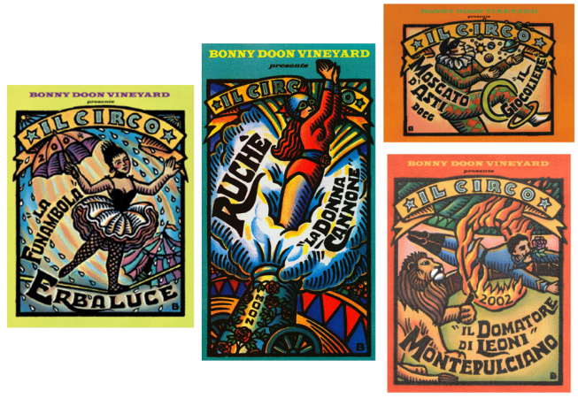
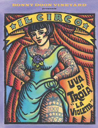
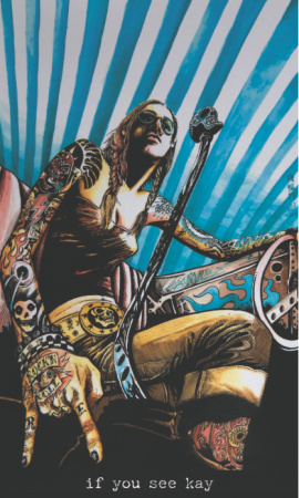
My favorite is “La Violetta,” the tattooed lady. This was a gesture to try to represent or exteriorize the essence of the wine itself on the label. Uva di Troia, a grape grown in Puglia, has the most particular perfume of violets, sometimes said to be a bit obvious or even tawdry, but that’s Violetta.
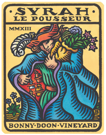
Here’s another label, “Syrah, “Le Pousseur,” also drawn by the marvelous Bascove. The design concept here is that I wanted the label to look like a Tarot card; I suppose I was just letting my unconscious mind wander freely, but there’s a long association of the occult with Southern France – the Gnostic association most notably. So, we invested a kind of seriousness through the fine art aspect of the label and by historical association. At the same time the enigmatic quality of the label, allows the customer to invest his or her own set of meanings into the illustration. It’s a sort of ongoing obsession, but we always try if possible to link some relevant attribute of the wine with the label itself; in this case it’s a bit fanciful and perhaps far-fetched, but the unconscious is very well capable of making connections. I wanted this archetypal, Tarot figure to be a slightly disreputable sort – a sort of flim-flam man, mountebank/grifter, but might he perhaps be a genuine Medicine Man? Why did I use this particular conceit? Proper, cool climate Syrah has such a strong perfume – white pepper and bacon fat – rotundone is the relevant molecule, by the way – in my febrile imagination, I thought of it almost as a vaguely illicit substance or at least one, like certain kinds of cough syrup, heavily regulated by governmental authorities.
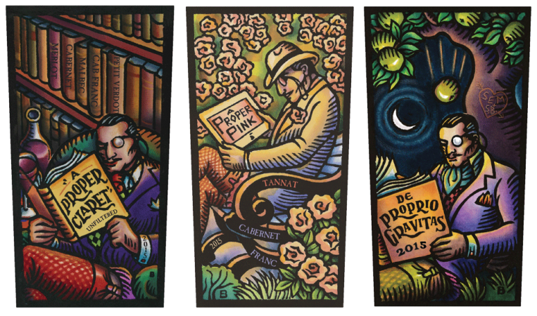
Bascove has done another series of labels for us – the so-called “Proper” wines. Here are “A Proper Claret”, “Gravitas” and “A Proper Pink.” The protagonist of this series is my alter-ego, whom I call Reginald ffrench-Postalthwaite. He’s a Tory, very, very Old Skool, and also quite given to wearing fishnet stockings at his ease. I love the detail that we’ve managed to include in the labels. On the Claret label, the names of the grape varieties are written on the spines of the books in his library, and on the Gravitas you can see the engraving (SB (HEARTS) Sem) on the tree. We hope that our customers appreciate these fine details. It’s a matter of faith for me that paying attention to these very small details on the label on some level conveys to the customer the fact that we are equally scrupulous in our attention to winemaking details as well.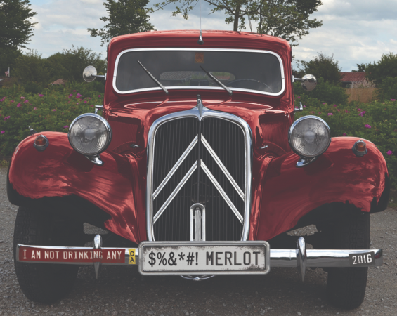
In fairness, not all of our labels have turned out to be majestic works of art. Here’s one we did somewhat cynically, called “I’m Not Drinking Any @#$%&! Merlot,” which of course is made from 100% Merlot. That’s an old Citroën Traction on the label. Perhaps shamelessly incorporating popular culture into the label does not represent our finest moment, but again, I am often incapable of passing on what I imagine at the time to be an amusing visual pun.
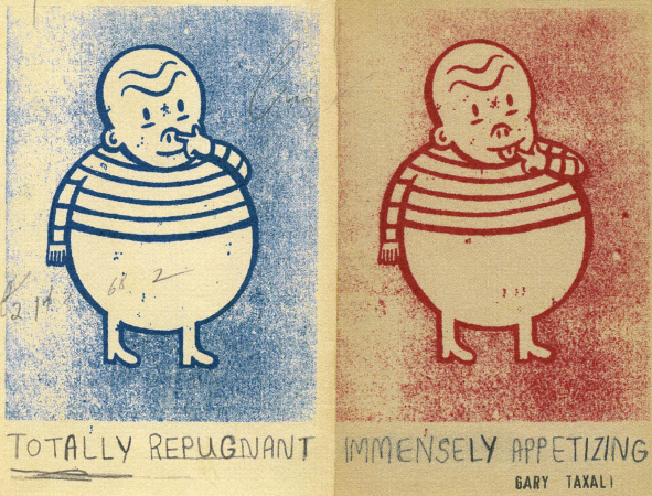
This is in fact my very favorite Bonny Doon label, done for us by the Canadian illustrator, Gary Taxali, and was created for a wine we made for our wine club from the very obscure grape, Freisa. (We made no less than three different versions of Freisa and were equally challenged in selling any of them.) This was for a dry red-style, and as you can see, we juxtaposed these two striking images side-by-side, definitely creating a bit of dramatic tension. Somewhere we had tracked down quotes from Robert Parker and Jancis Robinson, writing about how they really felt about the Freisa grape. “Immensely appetizing!” said Jancis, and “Totally repugnant!” opined Robert. I’m not sure how many converts we made to the Freisa cause with this label, but I have to imagine that somebody out there saw this label and smiled.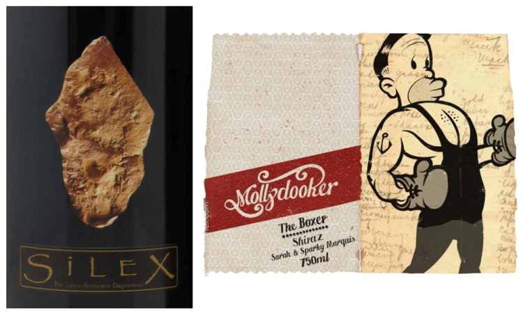
I’ll just take a brief moment here to weigh in on the subject of how differently the wine cultures of the Old and New World inform our respective wine labeling practices. To tell their story, great producers in Europe of an older generation will typically, maybe stereotypically, rely on the authority of the appellation itself, or the authority of a representation of the domaine or chateau on the label, such as you might find on a classified growth Bordeaux – based on the implicit French article of faith in the immutable hierarchical order of things. On the other hand, a younger generation winemaker from Alsace, the Loire or the Rhône, who has been blessed with a strong, expressive terroir, might express the unique quality of his or her wine in a different way, perhaps using the label to represent the unique characteristics of the geology that informs the wine. So, you’ll see labels that depict quartz or limestone or schist. For some of us mineral-head wine geeks, this is just catnip, a major turn-on, but to the average North American Joe Caymus, this in fact can represent a major turn-off. “I don’t want rocks in my wine!” he will cry. Instead, we get labels that promise an intense, rich hedonic experience, but don’t worry, you won’t have to worry about picking up nuances from any of those pesky minerals.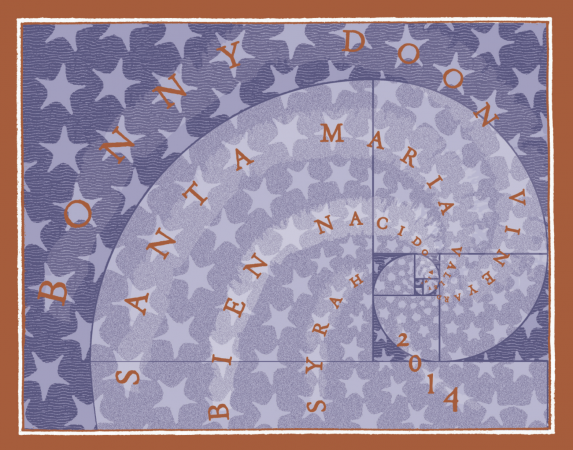
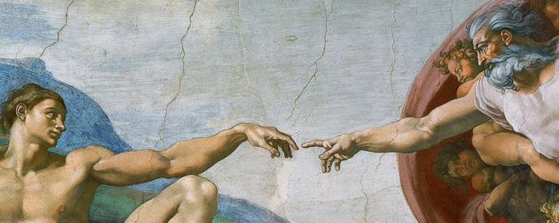
Obviously, not all of the wine labels we’ve done over the years have been played for laughs. We do, after all, attempt to make some reasonably serious wines from time to time. For example, we have been fortunate to source Syrah grapes from the superb Bien Nacido Vineyard in Santa Maria, which has helped us make some fairly grown-up wines. How do I attempt to convey to my perhaps slightly skeptical audience that this time, I’m serious! I didn’t want to put rocks on my label, but did want to express that I have in some fashion, made an attempt to capture a sense of the sublime order of nature, because that in fact is what terroir truly is, a reflection of Nature’s order. I found a great illustration of a representation of a spiral nebula, which is a form of the Fibonacci series, arguably God’s Greatest Hit or at least among His Top 3, and I hoped that the message got across at least subliminally.
It is my belief that sometimes labels just try too hard – that’s certainly been the case with some of ours – and of course that is the very last thing you want to convey to your customer; you don’t want them to ever see you sweat. For wine bottles are magical vessels assembled by magical elves who toil joyfully without complaint for the benefit of the discriminating, gentle consumer. But it is important to remember that creating a memorable and successful package is a collaborative process between the label designer and the consumer. I believe that a perfect label leads the consumer ¾ of the way, but also allows enough room for the individual to make that last final leap themselves and, at least for a moment or two, invest a little skin in the game through the engagement of their imagination. It has been a sincere pleasure to talk to you today.



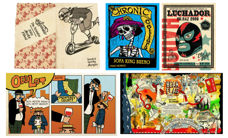

Terrific read. Wish I had heard it live. My wife and I own a small wine bar on Mercer Island in Washington State. It’s amazing to watch clients shoping the racks and spending a great deal of time on wines with labels that tell a story. The Mollydookers are often a hit and Stings labels from his IL Palagio Winery are clever as well. Who distributes your wines in Washington State? We’d like to carry them as we drank them often in the 80s and 90s.
Thanks so much for your note and for your support. Wines are sold by Elliott Bay in Washington State. You live in a very lovely part of the world; I will definitely stop by and see you the next time I’m in your hood.
Wonderful story and thanks to both, the presenter and teller.
Thanks. I had an absolute blast preparing the talk, and it was a sweet stroll through some (mostly) very pleasant memories. I have been so lucky to have worked w/ some great artists and designers, without whom I doubt I’d even realize I had any artistic sensibility whatsoever.
Great read and those labels bring back so many memories of the BD wines I have drank
over the years. I have always loved the original BD label and after falling in love with Le Cigare Volant I tracked down as many older BD wines as possible. Loved the La Reina (sp?) chard back then. The first time I tried Le Sophiste was at a tasting at The Mountain Winery that was under the original BD label and was named Le Sophiste “Cuvee Philosophic” IIRC. Surprised that Clos de Gilroy wasn’t mentioned, one of my favorites.
Thanks for kind note. Y’know, I thought about mentioning the Gilroy label, which is one of my favorites, but the speech was getting rather lengthy, and I needed to draw the line somewhere. The story (now it can be told) was that the Gilroy label began its life to look like an elegant French calling card (not too dissimilar from the first BDV/Latour/deMontille labels). But it did, frankly, look a bit too austere and I was just trying to find one more element that would read “French.” Literalist that I was, how better to convey Frenchness than to put a picture of a French person on the label. DeGaulle was the first person I thought of, but I think it was not permitted to put political figures on wine labels. The only other French person I could think of at the moment was Marcel Proust. The “Le Gil des Rois; le Roi des Gils” line was an afterthought that brought the whole concept together. The original Sophiste bottling that you mention is truly rare. I don’t think we bottled more than 20 or 30 cases; I can’t remember whether we even had enough to make a barrel; maybe just fermented in carboys.
[…] Keynote speech at Wines and Vines Packaging Conference, August 9th, 2018, Yountville, CA Only Randall could make a talk about wine labels so interesting. […]
Very kind, but honestly label art is infinitely fascinating.
Hi Randall,
Ab fab talk. Your creative flair may be surpassed only by your sense of humor! How I wish I had hear this live.
What snuck up on me though was your commercial perspective. Making choosing wine fun! That may end up being your greatest legacy. Pam.
I know that you are meaning well in your comment, but I really hope to (someday) make wines with real gravitas, that well transcend their clever packaging. Not buzz-kill wines, to be sure, that are all introspective and weird/nerdy and all, but wines that will somehow transform the imbiber (and their maker as well in the process.). And of course w/ a killer package.
What a wonderful distillation, Randall, of your years of producing iconic wines and iconic labels!!! Thanks so much for sharing!
It is my very great pleasure
[…] Keynote speech at Wines and Vines Packaging Conference, August 9th, 2018, Yountville, CA Only Randall could make a talk about wine labels so interesting. […]
Its very nice article.
Thanks, and glad you enjoyed. Have had a chance to think about these matters for many moons.
Immensely brilliant read doon memory lane, Randall!
I always wondered why you never bothered to buy land in the Rhône valley or the Languedoc to have a bonny go at making wine in France…now that would have been doon bloody bold!
Putain, mec! Ce n’est pas trop tard, non?!
Philippe
So glad you enjoyed the article. Afraid, it might well be trop tard pour moi. First, or d’abord, I think that the French (or indeed any European authorities) would have me under lock and key within the first ten minutes of my arrival – prophylactically, of course, and presumably for my own good. I don’t think that I would do a very good job of staying within the coloring lines, i.e. rules, and in Europe there are many. But the deeper question is really, Do I have anything to really offer the world as far as an understanding of makin wine in a foreign terroir that someone who has lived there all their life and can presumably do so much better? Don’t think that I will suddenly do a better job of revealing terroir than someone who has lived and worked and observed for years longer. I think that my work is best done in my own indigenous area, i.e. California, where I can perhaps do something truly original (and succeed or fail spectacularly). As you know I’m particularly interested in growing grapes from seedlings, which is rather difficult to achieve in the Old World, unless you are growing in pure sand, i.e. cannot support phylloxera. In fairness, despite my profound struggles with the French language, I have felt a lot more at home in southern France than almost anywhere else.
Randall Grahm burning bright
in the vineyards of a Provencale night;
What immortal hand or eye,
dare frame thy fearful symmetry?
Good kitty…. Nice kitty…..